The Narrative of Colour
Fluidity and Stochasticity
New Materials & Techniques
Methods, Process & Materials
Buddha’s new understanding of self and reality presented it as without essence, without permanence, constructed and compounded, yet not as non-existent. The way the self and all phenomena come into existence is termed paticca samutppada, or dependent origination. Everything that exists does so in dependence upon a network of causes and conditions.
In my experiments with printmaking, I try to find a way to reveal this ‘emptiness’ and ‘non-self’ of dependent origination. From the narrative behind the colours, the randomness of the fluidity media to the use of new materials and technologies, the so-called dependent origination of the material meaning of the object is constantly changing. My personal thoughts and the process of making prints intuitively represent a series of reasons and conditions on which the existence of things depends, and the experimental method of controlling variables results in the creation of prints with different thoughts and styles. These variations are summarised in the critical reflection section. In this process, it is not the ‘I’ that creates emptiness, but rather the ‘conditions’ that are created within the limits of what can be done at the moment, so that the tip of the iceberg is revealed to those things that are much bigger than the ‘I’.


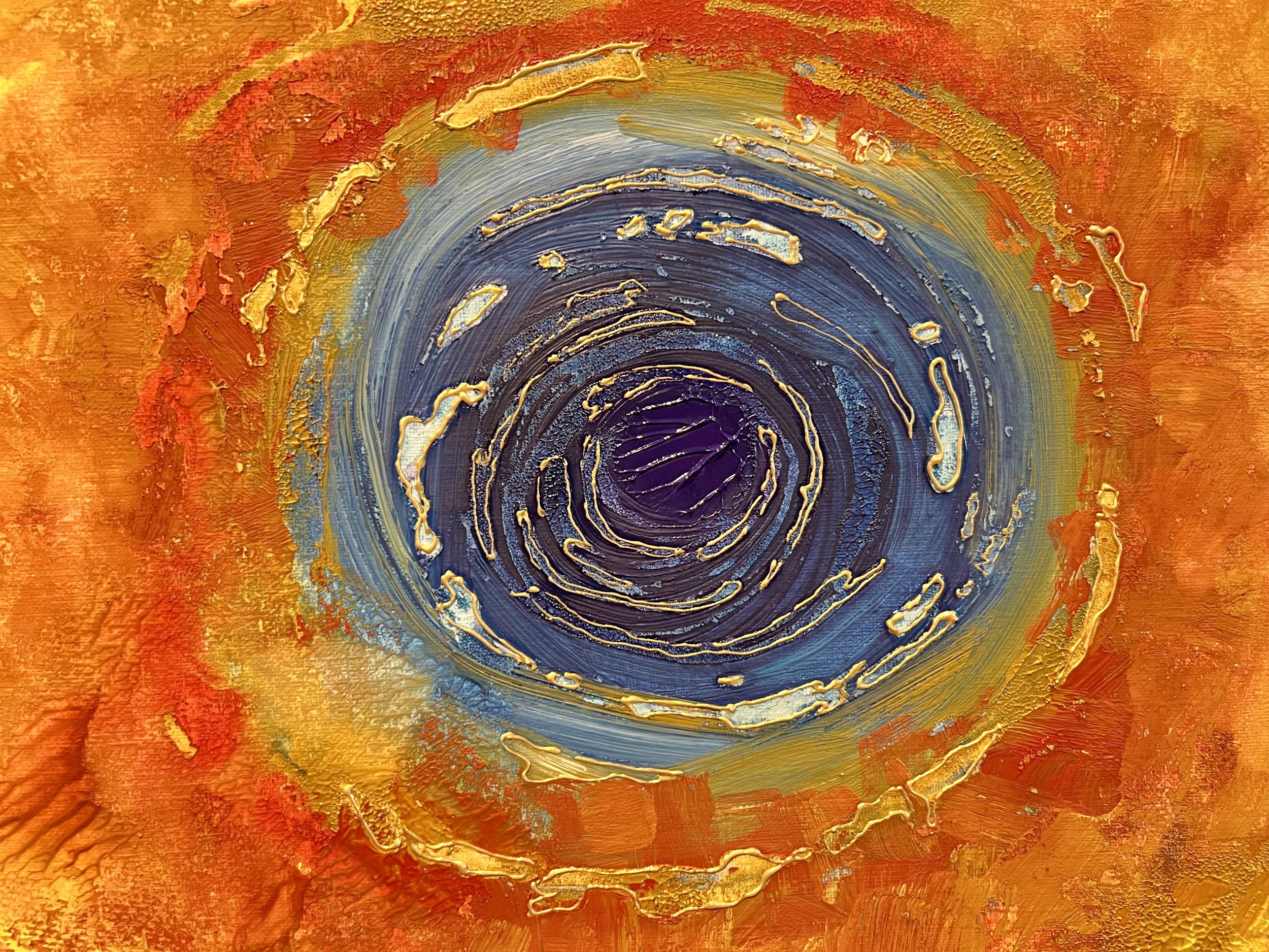


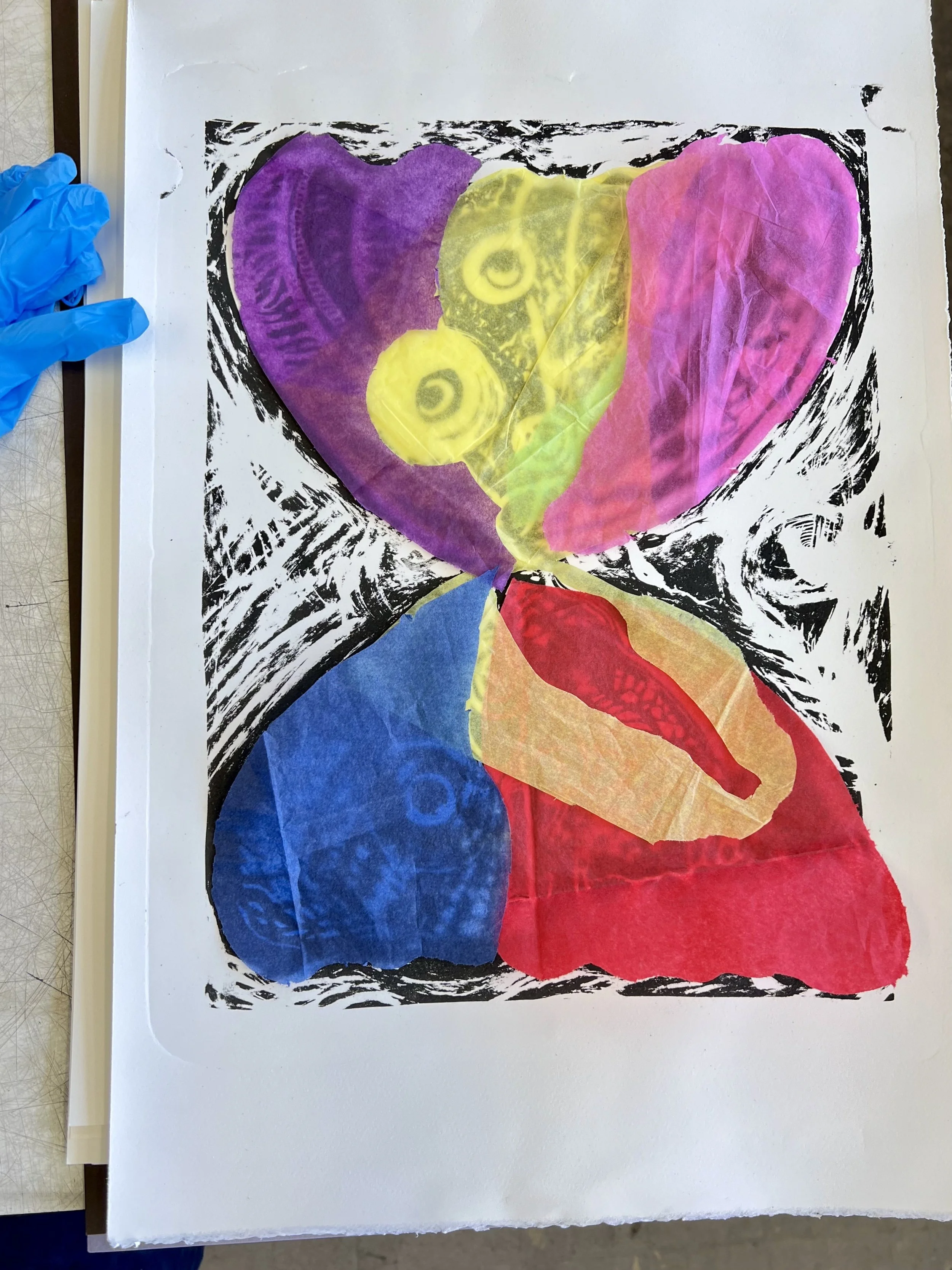
At the start of this unit I began to experiment with colour and new techniques, and tried to blur the representation of figurative shapes with more random textures. The choice of colours for this group of compositions came from Dr. Michael Newton's account of the colours of the soul in his book Journey of Souls(1994), and I simply chose the colours based on my understanding of the text as a way of imagining and feeling the existence of another possible being. I stacked the colours on a piece of canvas paper and transferred them by hand onto another piece of paper. After comparison, I prefer the transferred work, which is more detached from my sense of control, and the random white space makes the picture more ethereal. At the same time, the texture like coral or blood vessels in the picture reminds me of the transfer works of the artist Muxin, and I have found the direction I want to try next.
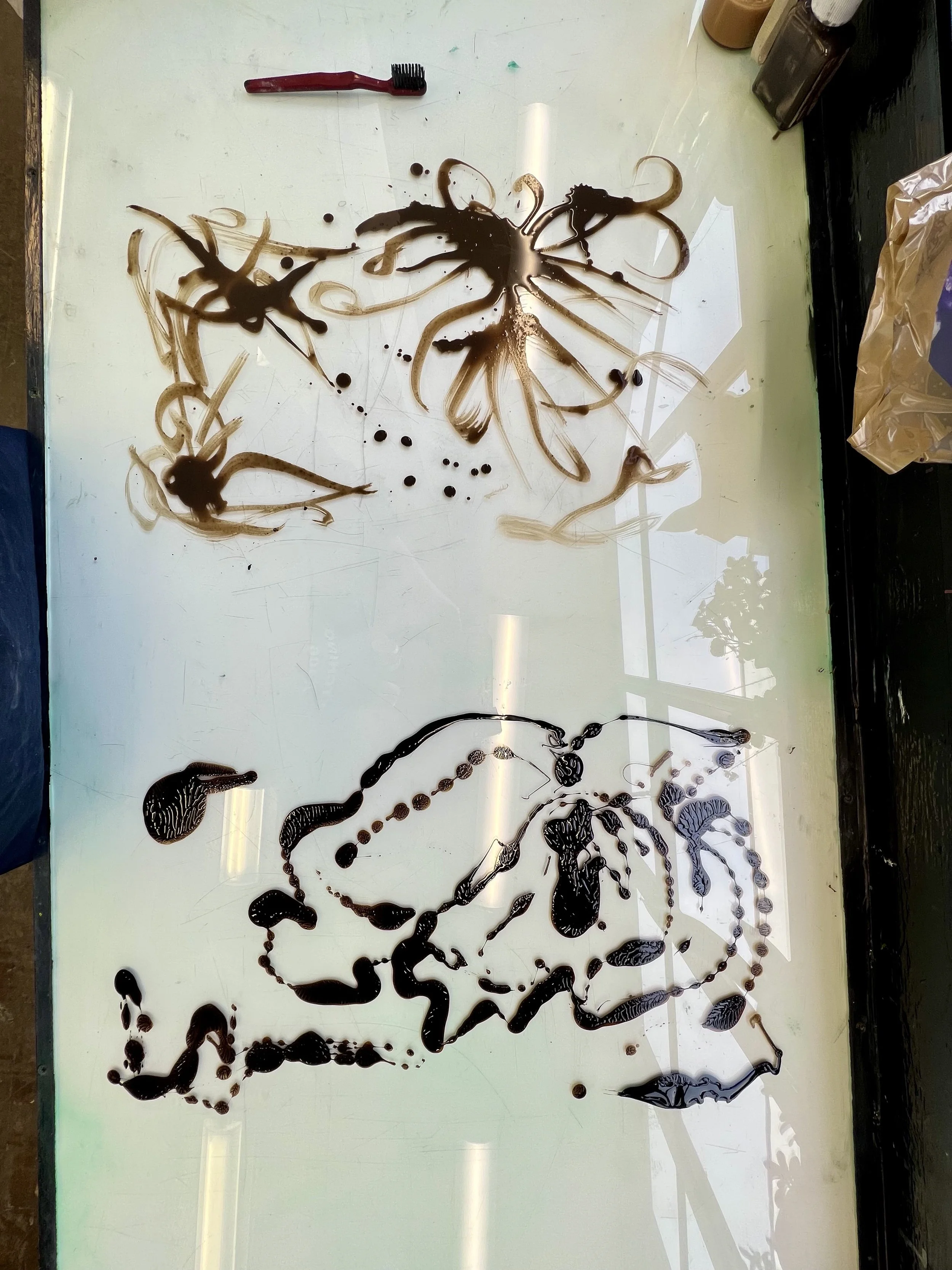
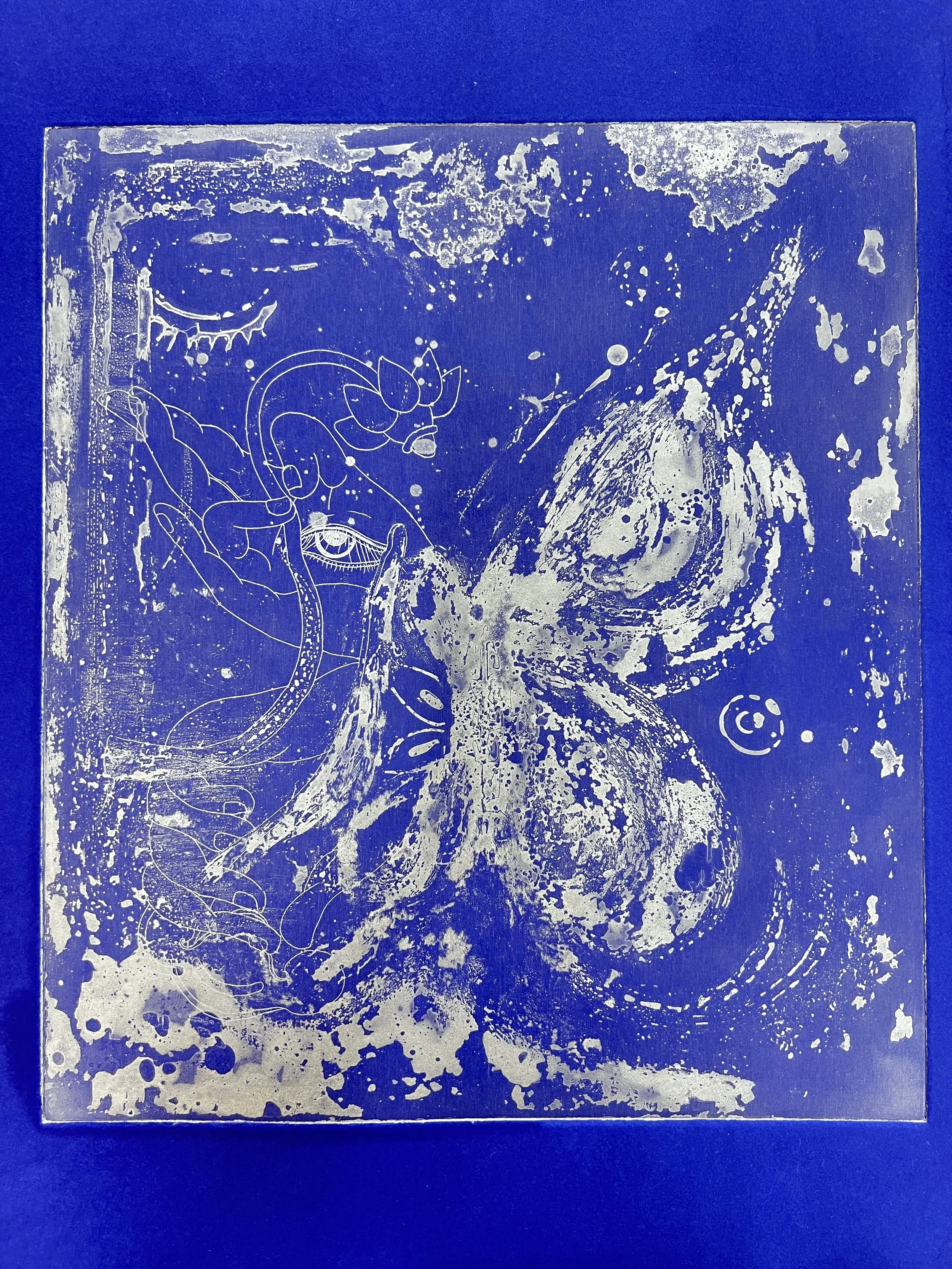
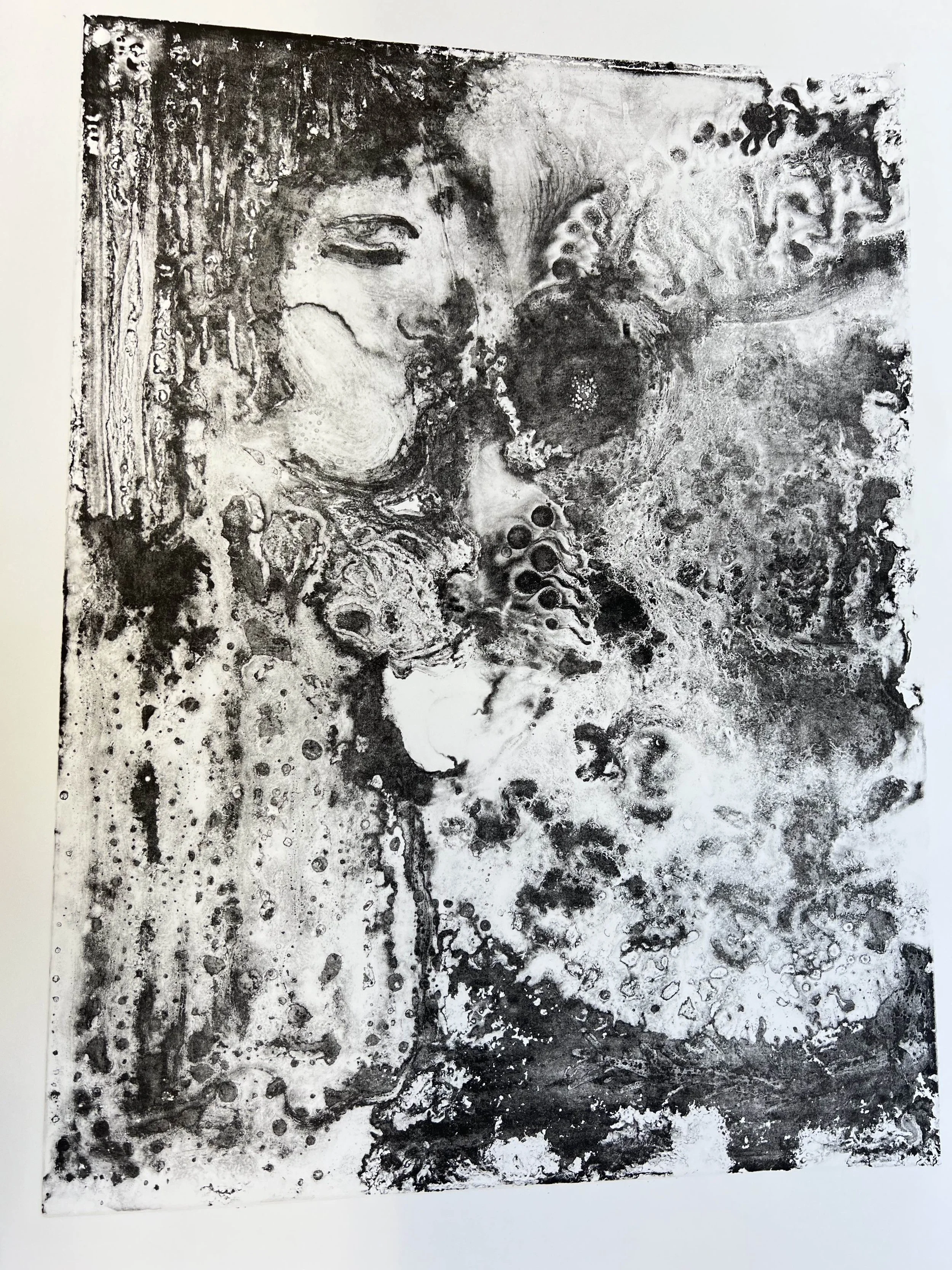
I think the best way to realise this type of transfer is to use acetate and zinc plates, which have a large area left for experimentation with fluidity and a more intuitive way to see the effect of the work. I worked with ink and asphaltene separately, and as a comparison I worked on both at the same time, overlaying each piece twice to increase the randomness of the materials and the natural effect of free blending. The results also proved that the malleability and fluidity of the materials could be visualised in the layering of the images, and the mixing of the two materials also gave the final prints the layered feel of two overlapping plates. At the same time, I found that changing the colour of the ink and the base colour of the printed paper could weaken this layered feeling. The gold ink and the dark base colour paper could enhance the visual unity, replacing the subconscious act of searching for figurative familiarity among the abstract patterns on the white paper with the black ink. It was also from this creation that I began to read Max Ernst's books in order to find the sense of harmony in the structure of the picture with randomness of transfer.
One of the watercolour re-creations based on prints became an exhibit at Milbank Show. The curatorial process was very smooth, and this work was given the largest area of wall and white space in the gallery, which allowed me to clearly appreciate the truth that less is more. At the same time, when my daily creations were hung in the exhibition space, it gave me a chance to re-examine my work, and from a professional point of view, I saw a lot of areas that could be improved: firstly, I pinched off the idea of adding figurative elements to abstract works, which is a bit like suddenly adding a line to a piece of classical music, and if not handled correctly, it could easily upset the balance of the picture. Secondly, I realised that the image needed to be absolutely clean and flat, as any imperfections would be magnified by the light of the exhibition. Finally, I knew that I needed to start working on larger scale works, not because the white space in the gallery made my paintings look small, but because in this exhibition space, I realised that it was time to create more than just daily exercises.
Milbank show, 2024, taken at Milbank tower
Blue Lake, 2024, 56 x 76cm, watercolour ,ink, asphaltene on paper
BEING series #2-4 were a total relaxed, uninhibited experiment. Water-based and oil-based materials, brushes, asphalt powder, and my palms and fingers were all involved. If there is subjectivity in the creative process, it is perhaps the intentional choice of mediums that are antagonistic in nature, to create an image that balances repulsion and fusion. My creations are related to emptiness and spirituality, and it is interesting to note that I have found a medium that is very much of this nature - asphalt powder. It's like a ghost in that you don't know when it's going to be erased or how much of it is going to show up at the end of the day. Sometimes the area where it is located disappears in its entirety, and sometimes it gradually reveals itself as part of the printing process. Asphalt powder seems to innately understand the white space and impermanence of the philosophy of emptiness.
Taken at Intaglio Printmaker
After visiting Intaglio Printmaker recommended by teachers, I was pleasantly surprised to find many of the materials here very elegant and well-made, and picked up many papers and chine colle papers I hadn't tried before as a trial. The two below are zinc plates printed on kozo paper, this was the first printing of these two plates. As I noticed that the first printing of the series had a very rich and deep detail, just with less ink content. This decision proved to be the right one, as the little ink in the first print allowed the kozo rice paper to grip it well without penetrating away, while the fine details and the soft mixing of the texture of the rice paper have the beauty of a lightly literati painting.
At the same time, I also applied these newly procured papers to other existing prints, including the etching prints created in the previous unit (above) and the stone litho (below), which had never been printed. Through the layering of different colours, chine colle and changing of base colours, they gave birth to a series of visual languages with impact and some unexpected effects: some warm and close to nature, some cool and with a kind of silvery detachment, some boldly colliding and breaking through the rectangular frame. What surprised me most about etching was the effect of the gold pigment on the black Velin Arches Noir paper, especially in the sunlight, and the descriptions that came to mind were ‘compassionate’ and ‘inclusive’, ‘divine tenderness’. I realised that colours can convey a lot of information on their own, and that combining them with a particular image can enhance a particular atmosphere, and the special effect of gold and the tutor's advice paved the way for my subsequent use of gold leaf.
In my experiments in search of an ethereal effect, I tried the spit bite approach and manual transfers on plate in small areas. Both styles were very interesting, giving a combination of haze and clarity. But I also knew that I would need a lot of experimentation time and energy before I could get a satisfactory and stable way of creating in etching. So I chose to put the new way of creating on hold for the time being, and turned to lithography, which I've already started to get the hang of.As tutor suggested: Once you find something really exciting we do it again and again, you might spend six months for working on this to get it better and better; In the end you have got the best it could be, and then move on to another set of work. I'm glad I've found that ‘something’ in lithography so far, so next I'm going to invest more time in letting the work grow with my discoveries.
In the following experiments, I created and compared lithography by controlling variables (the so-called dependent origination of material meaning). I try to change the conditions (materials), and the reasons (personal thoughts and perspectives) for each piece to create different meanings of emptiness. There are times when I think the image I have created has deviated from the concept, and I will reflect on what has caused this deviation: is it too much human intervention? Is it a lack of familiarity with the medium? Or is it the over-searching for emptiness in my mind that hinders the emptiness of the image? Often after this self-reflection, I am able to see my actions and my thoughts more clearly and can observe them in time for their next occurrence. The interesting point is that I can only change the mood of the picture by controlling or being aware of my intention, not in reverse.
At the end of the unit, I shifted the object of dependent origination to the AI's transformation of my picture. After entering the keyword of emptiness, my work seemed to visually break out of the two-dimensional plane. I projected the new image onto the original work with a strong feeling of co-creation with technology. This also opens up a whole new perspective of understanding emptiness: the moment when the projection and the prints are intertwined is the overlap of the two present moments, and the rest is emptiness. The recording of that momentary print represents what human beings think of as reality, which is in fact a momentary dream bubble in emptiness. These gains and new discoveries will continue in the next unit, and I might will know how to follow the footsteps of ‘Awareness' better.


